20 Essential Retail KPIs You Can Measure with People Counting Systems (Complete Guide 2026)
In 2026, the difference between a thriving retail store and one that struggles is no longer just about product selection or pricing — it’s about how well you understand what happens inside your four walls. People counting systems and footfall analytics platforms have matured into comprehensive intelligence engines that can track, measure, and help you optimise nearly every aspect of your physical store performance.
This complete guide covers 20 essential retail KPIs measurable with today’s people counting technology — what each metric means, why it drives real business outcomes, and exactly how to act on the data.
Part 1: Traffic & Demand KPIs
1. Foot Traffic (Store Visits)
What It Is
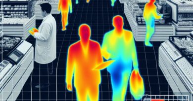
Foot traffic is the total number of individual visitors who enter your store during a defined period. Learn more about how it’s measured in our complete footfall counting guide — hour, day, week, month, or year. It is the master metric from which virtually all other retail KPIs are calculated or contextualised.
Why It Matters
Foot traffic is the heartbeat of your store. It determines the maximum possible number of transactions you can generate, informs staffing levels, and serves as the baseline for evaluating the effectiveness of every marketing activity, store redesign, or operational change you make. A sustained drop in traffic is often the earliest warning sign of a competitive or brand problem — appearing weeks or months before a revenue decline becomes undeniable.
How to Use It
Track foot traffic at hourly, daily, and weekly granularity. Layer it against your marketing calendar to identify campaign-driven lifts. Compare year-over-year and month-over-month to separate seasonal patterns from genuine trend shifts. Use hourly data as the primary input to your staff scheduling model, ensuring you match labour supply to customer demand rather than relying on historical conventions.

2. Capture Rate
What It Is
Capture rate is the percentage of people who pass your store and actually enter it: Capture Rate = (Entrants ÷ Passersby) × 100. It requires a sensor outside the store entrance to count ambient pedestrian traffic, plus your standard door counter for entrants.
Why It Matters
Your location provides a fixed pool of potential customers every day. Capture rate tells you how effectively your storefront — its window displays, signage, entrance layout, and exterior appeal — converts that ambient traffic into paying visitors. Unlike marketing spend, improving your capture rate costs relatively little but can add hundreds of incremental daily visitors.
How to Use It
Benchmark your capture rate against comparable stores in the same centre or street. A/B test window display concepts by monitoring weekly capture rate changes. Set a target capture rate improvement (e.g., from 8% to 11%) and measure which storefront changes move the needle most. Even a 2–3 percentage point improvement on a busy high street can translate to tens of thousands of additional annual visitors with zero incremental ad spend.
3. Peak Hour Traffic Distribution
What It Is
Peak hour distribution maps visitor volume across every hour of the trading day, revealing not just when your busiest periods are but the full shape of your daily demand curve — how quickly traffic ramps up in the morning, how pronounced the midday spike is, and how quickly the evening tails off.
Why It Matters
Most stores have predictable daily patterns, but the specific shape of the curve varies dramatically by store type, location, and day of week. A grocery store peaks at 5–7 pm on weekdays; a destination fashion retailer may peak Saturday afternoon. Without precise hourly data, staffing and promotional timing decisions are based on assumption rather than evidence.
How to Use It
Use hourly traffic distribution as the primary driver of shift scheduling. Align your promotional activities — in-store demos, discount activations, social media pushes — to the 1–2 hours before your natural peak to capture customers who are already heading your way. Use off-peak hours for stock replenishment, training, and visual merchandising work that would disrupt the shopping experience at busy times.
4. Day-of-Week Traffic Patterns
What It Is
Day-of-week analysis shows how visitor volumes differ across Monday through Sunday. Most retailers see significant variation, with weekday traffic often 40–60% lower than weekend volumes in destination retail, while convenience and commuter-adjacent stores may see the inverse pattern.
Why It Matters
Understanding day-of-week patterns allows you to right-size staffing for every day individually rather than using a weekly average, which overstaffs slow days and understaffs busy ones. It also informs promotional timing — running your biggest promotions on your highest-traffic days maximises the number of customers who see and act on them.
How to Use It
Create a day-of-week staffing matrix with a different target headcount for each day, derived from actual footfall data rather than gut feel. Use low-traffic days for deep-clean operations, staff training sessions, and supplier meetings. Build your promotional calendar around peak days to maximise return on in-store marketing investment.
Part 2: Conversion & Revenue KPIs

5. Conversion Rate
What It Is
Conversion rate is the percentage of store visitors who complete a purchase: Conversion Rate (%) = (Transactions ÷ Visitors) × 100. It is calculated by dividing your POS transaction count by your people counter visitor count for the same period.
Why It Matters
Conversion rate is the most direct measure of how effectively your store converts footfall into revenue. To choose the right technology for measuring this accurately, see People Counting Solutions Compared. A high-traffic store with a low conversion rate is a leaking bucket — you are attracting customers but failing to sell to them. Even a 1–2 percentage point improvement in conversion on a 1,000-visitor day represents 10–20 additional transactions, all without spending a dollar on marketing.
How to Use It
Track conversion by hour and day of week. Identify the time periods where conversion drops relative to traffic volume — these are your opportunity windows. Investigate whether low-conversion periods correlate with low staffing, product stockouts, or specific customer demographics. Implement targeted interventions: proactive staff greeting during high-traffic/low-conversion windows, strategic placement of popular items near the entrance, and optimised checkout processes to reduce abandonment at the final hurdle.
6. Revenue Per Visitor (RPV)
What It Is
Revenue Per Visitor is a composite efficiency metric calculated as: RPV = Total Revenue ÷ Total Visitors. It collapses conversion rate and average transaction value into a single number that tells you how much monetary value each person who walks through your door generates on average.
Why It Matters
RPV is the best single-number summary of your store’s commercial efficiency. It accounts for both your ability to convert visitors and your ability to extract value from those who buy. A store with rising RPV is doing more with each customer visit. A falling RPV despite stable traffic signals either a conversion or basket-size problem — or both.
How to Use It
Use RPV as a store-to-store benchmarking metric, controlling for differences in location traffic volume. Set monthly RPV targets and track performance at the zone level where your analytics platform supports it. Identify which departments consistently underperform on RPV and investigate whether the issue is product range, layout, signage, or staffing. RPV is also an excellent metric for evaluating staff performance — the most effective floor staff tend to generate disproportionately high RPV during their shifts.

7. Average Transaction Value (ATV)
What It Is
ATV measures how much the average purchasing customer spends in a single visit: ATV = Total Revenue ÷ Number of Transactions. When combined with footfall data, it reveals how much each buying visitor is worth to your business.
Why It Matters
ATV and conversion rate are the two primary levers of revenue growth that do not require increasing foot traffic. Growing your ATV by 10% on a day with 500 converting customers produces the same revenue uplift as converting 50 additional visitors at your current average spend — often far more achievable. ATV also directly measures the effectiveness of your upselling strategy, promotional bundle offerings, and floor layout.
How to Use It
Segment ATV by time of day, day of week, and season. If your weekend ATV is significantly higher than your weekday average, understand why — is it a different customer demographic, different promotions, or different staff? Replicate successful weekend tactics on weekdays. Train staff to actively suggest complementary items and implement strategic product pairings (accessories displayed adjacent to core products) to nudge basket size upward at every opportunity.
8. Units Per Transaction (UPT)
What It Is
UPT measures the average number of individual items in each customer’s purchase: UPT = Total Units Sold ÷ Number of Transactions. While ATV captures the monetary value of baskets, UPT captures their physical volume, which can differ when price points vary.
Why It Matters
UPT is particularly valuable in fashion, grocery, and general merchandise retail where the number of items in a basket is a meaningful indicator of shopping engagement. A rising UPT suggests customers are discovering and picking up more items per visit — a sign of effective merchandising, compelling promotions, or high staff engagement. A declining UPT may signal that customers are becoming more focused (or price-conscious) shoppers.
How to Use It
When foot traffic data tells you a specific time period has high visitor volume but low UPT, investigate whether product discovery is being impaired — perhaps a key promotional display isn’t performing, or a cross-merchandising opportunity is being missed. Use “two for” and bundle promotions specifically to target low-UPT time periods and lift basket depth during those windows.
Part 3: Customer Behaviour KPIs
9. Dwell Time
What It Is
Dwell time measures how long a customer spends inside your store or within a specific zone. It can be tracked for the overall store visit or broken down by department, display, or product area using overhead sensor arrays or camera-based analytics.
Why It Matters
Dwell time is a strong leading indicator of purchase intent and eventual spend. Customers who spend more time browsing tend to discover more products, become more emotionally engaged with the brand experience, and ultimately spend more. A declining average dwell time often signals that something in the store is failing to hold attention — whether that’s visual merchandising, product relevance, store atmosphere, or staff engagement.
How to Use It
Use zone-level dwell time to evaluate the pull-power of specific displays and product categories. Compare dwell time before and after merchandising changes to assess their effectiveness. Set a target minimum dwell time for your store type (typically 8–15 minutes for fashion, 15–25 minutes for home goods) and use dwell data to identify and address the factors that are shortening visits below that target.
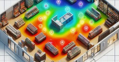
10. Zone Analytics & Heat Mapping
What It Is
Zone analytics segment your store floor into defined areas and measure the volume of traffic each zone attracts, how long customers dwell in each zone, and the flow of customers between zones. Heat mapping visualises this as a colour-coded overlay on your floor plan (learn more about retail analytics best practices), revealing hot zones (high traffic) and cold zones (under-visited areas).
Why It Matters
Floor space is your most expensive asset after labour. Heat mapping reveals exactly which parts of your store are doing productive work and which are dead space. It also exposes the natural customer journey — the paths most customers take through your store — which is essential information for floor planning, promotional placement, and product sequencing decisions.
How to Use It
Use heat maps to place your highest-margin products in high-traffic zones and your impulse-purchase items along the most travelled paths. Identify cold zones and experiment with drawing customers toward them using way-finding elements, promotional signage, or attractive visual merchandising. Measure every floor layout change through before-and-after zone traffic comparisons to build a rigorous evidence base for what works in your specific store environment.
11. Customer Flow Path Analysis
What It Is
Flow path analysis goes beyond zone heat maps to track the specific routes customers take through your store — which department they visit first, the sequence of zones they move through, and where they exit the active shopping area. Advanced AI video analytics platforms can reconstruct anonymised individual journey paths for statistical analysis.
Why It Matters
Understanding how customers physically navigate your space is the foundation of intelligent floor planning. If 80% of customers enter and immediately turn right, the left side of your entrance zone is underperforming as prime real estate. If customers consistently skip your accessories department entirely, the department’s location or visibility may be the issue rather than the product range.
How to Use It
Map the most common customer journeys and use them to inform your floor plan design, ensuring that key product categories fall naturally along the most-travelled paths. Identify “journey shortcuts” — paths customers take that bypass significant parts of your store — and design physical or visual interventions to encourage more complete exploration of your floor. Use flow data to determine optimal placement for new product launches, ensuring they are positioned where maximum customer traffic will encounter them.
12. Bounce Rate (Entry Zone Exits)
What It Is
Physical retail bounce rate measures the proportion of visitors who enter the store but leave within a very short period (typically 30–60 seconds) without engaging with the merchandise or moving beyond the entrance zone. It is distinct from capture rate — these are customers who did enter but immediately departed.
Why It Matters
A high bounce rate indicates a failure of the in-store first impression. Something about the immediate entrance experience is discouraging customers from staying: poor layout, intimidating or confusing presentation, off-putting ambient conditions (temperature, smell, noise), or staff who fail to acknowledge arriving customers. Every bounced visitor represents a fully counted footfall entry that contributes nothing to revenue.
How to Use It
Use entrance-zone sensors to measure your bounce rate and benchmark it against your wider conversion rate data. Experiment with entrance redesigns — an inviting, clearly navigable entrance zone with strong hero product displays tends to dramatically reduce bounce rates. Ensure staff are positioned and briefed to acknowledge every entering customer within 30 seconds. Track bounce rate as a leading indicator of store experience quality alongside customer satisfaction survey data.
Part 4: Operational Efficiency KPIs

13. Staff-to-Customer Ratio
What It Is
Staff-to-customer ratio is calculated by overlaying live or historical people counting data (customer traffic by hour) with staff scheduling data (employees on the floor by shift). It tells you whether your staffing level at any given time is appropriately matched to customer demand.
Why It Matters
Labour is typically 10–20% of retail revenue — the largest controllable cost after cost of goods. Calculate the ROI of people counting with our People Counting ROI Calculator. Overstaffing during quiet periods wastes payroll budget. Understaffing during peak times degrades customer service, reduces conversion, and damages brand reputation. Matching the two with precision is one of the highest-ROI applications of people counting data available to any retailer.
How to Use It
Build footfall-based shift templates for each day of week, replacing fixed rosters with demand-responsive schedules. Identify chronic mismatches — the habitual Tuesday morning overstaff, the Saturday afternoon understaff — and eliminate them. Many retailers report 5–15% reductions in total labour costs after transitioning to footfall-driven scheduling, while simultaneously improving customer satisfaction scores because staff are present when and where customers most need them.
14. Queue Length & Wait Time
What It Is
Queue analytics use sensors positioned at checkout areas and service counters to measure how many customers are waiting, how long the average wait before service is, and how these figures fluctuate across the day. Real-time queue data can trigger automated alerts when thresholds are exceeded.
Why It Matters
Long queues are one of the most cited reasons for abandoning a retail purchase. Research consistently shows that customers will tolerate a wait of up to 3–4 minutes before their satisfaction begins to deteriorate significantly — and that the perceived wait time often exceeds the actual wait time if customers feel uninformed or unacknowledged. Every abandoned queue represents a completed product selection that converts to zero revenue.
How to Use It
Set queue-length thresholds that automatically alert store managers when the number of waiting customers exceeds your service standard. Use historical queue build-up data to predict high-demand periods and pre-position additional checkout staff before queues form. Integrate queue data with self-service checkout triggers to open additional lanes dynamically. Measure the impact of queue management improvements on basket abandonment rates and customer satisfaction scores.
15. Occupancy Rate & Capacity Utilisation
What It Is
Occupancy rate measures the number of people in your store at any given moment as a percentage of your store’s maximum comfortable or regulatory capacity. Real-time occupancy data is particularly critical for large format stores, events, and compliance with health and safety regulations.
Why It Matters
Beyond regulatory compliance, occupancy rate is a measure of how intensively your floor space is being used. A store consistently at 20% of comfortable capacity has a very different operational profile from one regularly approaching its limits. Chronic over-occupancy during peak periods degrades the shopping experience; chronic under-occupancy may suggest a pricing, range, or marketing problem. Occupancy data also enables dynamic pricing, opening-time adjustments, and event planning decisions.
How to Use It
Deploy real-time occupancy displays (for large stores or events) to manage customer flow and ensure comfortable shopping conditions. Use historical occupancy data to determine whether extended trading hours or earlier opening times could capture additional revenue from overflow demand. Implement automated alerts when occupancy approaches maximum thresholds to allow proactive management before the experience degrades.
16. Return Visitor Rate
What It Is
Return visitor rate identifies the proportion of store visits made by repeat customers versus first-time visitors. This requires either anonymised device-based detection (Wi-Fi/Bluetooth analytics with customer consent) or integration with loyalty programme scan data and footfall timing. It is expressed as: Return Visitor Rate = (Returning Visits ÷ Total Visits) × 100.
Why It Matters
Repeat customers are the foundation of sustainable retail business. They cost less to serve than new customers, tend to have higher average transaction values, are more likely to recommend the store, and are more resilient to competitive pricing pressure. A declining return visitor rate is a leading indicator of eroding customer loyalty, often appearing before it is visible in transaction data.
How to Use It
Use return visitor data to evaluate the effectiveness of your loyalty programme — are loyalty members visiting more frequently than non-members? Use visit frequency segmentation to identify your highest-value customers and ensure your store experience is optimised for them. Identify the gap between return rates across different store locations or time periods to understand which stores are winning repeat business and why.
Part 5: Marketing & Experience KPIs
17. Marketing Campaign Traffic Lift
What It Is
Campaign traffic lift measures the incremental increase in foot traffic attributable to a specific marketing activity — a paid social campaign, an email promotion, an outdoor advertisement, or a PR event. It is calculated by comparing traffic during the campaign period to a baseline established from prior comparable periods, controlling for seasonal factors.
Why It Matters
Without footfall data, measuring the offline impact of marketing spend is largely impossible. A retailer can know that revenue increased during a campaign week, but cannot distinguish between the campaign’s contribution and natural seasonal variation. With people counting data, you can isolate the traffic lift attributable to each activity, calculate the cost per incremental visitor, and compare the efficiency of different marketing channels with the same rigour applied to digital campaigns.
How to Use It
Establish a rolling baseline traffic model by day of week and month, then measure deviations against that baseline whenever a marketing activity is active. Calculate cost per incremental visitor for each campaign type and use this to allocate budget toward the highest-performing channels. Over time, build a marketing mix model that tells you exactly what combination of activities drives the most incremental footfall at the lowest cost per visitor.
18. Promotional Effectiveness Rate
What It Is
Promotional effectiveness rate measures the impact of in-store promotional activities — feature displays, end-caps, seasonal fixtures, price promotions — on traffic to the zone where the promotion is placed, the dwell time in that zone, and the conversion rate and units sold from the promoted products. It requires zone-level people counting analytics combined with POS data.
Why It Matters
Retail promotions are significant investments of money, labour, and floor space. Yet most retailers evaluate promotions solely on total sales uplift, without understanding whether the performance came from the display placement, the price reduction, the product novelty, or simply ambient traffic. Zone analytics allow you to decompose promotional performance and understand which elements are driving results.
How to Use It
Track zone traffic, dwell time, and conversion rate before, during, and after each promotional fixture. A promotion that increases zone traffic but not conversion suggests the display is attracting attention but failing to persuade — a pricing or presentation issue. A promotion that improves zone conversion without drawing incremental traffic is doing a great job of selling to motivated shoppers but may need better signage or positioning to reach a wider audience. Use this granular analysis to continuously refine your promotional execution formula.
19. Experience Quality Score (EQS)
What It Is
Experience Quality Score is a composite metric that combines people counting operational data — dwell time, bounce rate, conversion rate, queue wait time, and staff-to-customer ratio — into a single index score that represents the overall quality of the in-store customer experience at any given time. The weightings of each component can be calibrated to reflect your specific service model and customer expectations.
Why It Matters
Individual KPIs each tell part of the story, but no single metric captures the full quality of the customer experience. EQS synthesises multiple data streams into a single daily or hourly score that store managers can act on quickly without needing to parse multiple dashboards. It also enables meaningful cross-store comparisons that account for the multidimensional nature of customer experience quality.
How to Use It
Build your EQS model by identifying the 4–6 people counting metrics that most strongly correlate with your customer satisfaction survey scores and revenue performance. Weight them accordingly. Use the daily EQS as a management dashboard headline metric. Set minimum EQS thresholds that trigger review processes, and use week-over-week EQS trends as an early warning system for experience deterioration before it shows up in revenue figures.
20. Sales Per Square Metre / Square Foot
What It Is
Sales per square metre (or square foot) measures the revenue productivity of your retail floor space: Sales/m² = Total Revenue ÷ Total Floor Area (m²). When enhanced with people counting zone data, it can be calculated at the zone level to identify which areas of your floor are generating the most revenue per unit of space.
Why It Matters
Retail rent is calculated per square metre. The fundamental question of space productivity — are you generating enough revenue from each metre of floor you are paying for? — is one that every retailer must answer. Sales per square metre is the universal benchmark for retail space efficiency, used by property landlords, investors, and retail boards to evaluate store performance. When combined with zone-level footfall analytics, it becomes a tool for making evidence-based decisions about floor plan optimisation, space allocation between departments, and the value of expanding or contracting specific areas.
How to Use It
Calculate sales/m² at the overall store level and compare to industry benchmarks for your sector. Then drill down to zone level: identify which departments are generating above-average and below-average sales per square metre. Consider reallocating floor space from low-productivity zones to high-productivity ones, but use zone footfall data to distinguish between zones that underperform because of low traffic (a location problem) and those that underperform despite good traffic (a product, pricing, or presentation problem). Each requires a different intervention strategy.
Bringing It All Together: Your Retail Analytics Framework
The most powerful insight from this guide is not the value of any individual KPI — it is the value of the connections between them. People counting technology, at its best, does not give you 20 separate data streams. It gives you a unified model of customer behaviour that explains your business performance from the moment someone approaches your storefront to the moment they complete (or abandon) a purchase.
Consider: foot traffic tells you demand; capture rate tells you storefront effectiveness; conversion rate tells you selling effectiveness; ATV tells you basket optimisation; dwell time tells you engagement quality; zone analytics tell you which parts of your store are working; queue data tells you friction points; staff ratio tells you operational alignment. Together, they form a complete cause-and-effect chain from ambient pedestrian traffic to revenue in the till.
The retailers gaining the strongest competitive advantage from analytics are those who have moved beyond reporting on individual metrics and built integrated dashboards where these connections are visible in real time — allowing managers to diagnose problems, test solutions, and measure results with the same rigour applied to e-commerce operations.
Choosing the Right People Counting Technology
The 20 KPIs in this guide require different levels of technology sophistication to measure accurately:
- Basic infrared beam counters deliver KPIs 1, 4, and 13 (foot traffic, day-of-week patterns, basic staff ratio). Low cost, suitable for single-door locations, but limited in group separation accuracy.
- 2D video sensors add basic zone analytics and improve accuracy in multi-person scenarios. Support KPIs 1–5 and 9–10 at moderate accuracy.
- 3D stereoscopic sensors (97–99% accuracy) support all traffic, conversion, dwell, and zone KPIs (1–12) and are the most widely deployed solution in mid-to-large format retail.
- AI overhead video analytics support the full 20-KPI framework including flow path analysis, bounce rate, EQS, and zone-level promotional effectiveness. Best-in-class for comprehensive retail analytics programmes.
- Wi-Fi / Bluetooth analytics complement sensor-based systems with return visitor identification and dwell time enrichment but should not be used as standalone traffic counting solutions due to inconsistent device detection rates.
For independent, up-to-date comparisons of the leading people counting system providers — including accuracy benchmarks, pricing, integration capabilities, and retail case studies — visit PeopleCountings.com, the industry’s most comprehensive resource for footfall analytics intelligence.
Final Thoughts
Retail has always been a discipline of marginal gains — small improvements across many variables that compound into significant competitive advantage over time. The 20 KPIs covered in this guide represent 20 distinct opportunities to find and act on those gains in your physical store environment.
Each metric is measurable today. Each one offers a clear, actionable path to improved performance. And each one becomes more powerful when viewed in the context of the others — which is exactly what a modern people counting analytics platform is designed to deliver.
The stores that win the next decade will be those that treat their physical space with the same analytical rigour that digital businesses apply to their websites. The data is available. The technology is accessible. The question is simply whether you choose to use it.
Ready to find the right people counting solution for your retail operation? Compare the top 50 providers by accuracy, price, and analytics capabilities in our 2026 Power List: Top 50 People Counting Solution Providers.